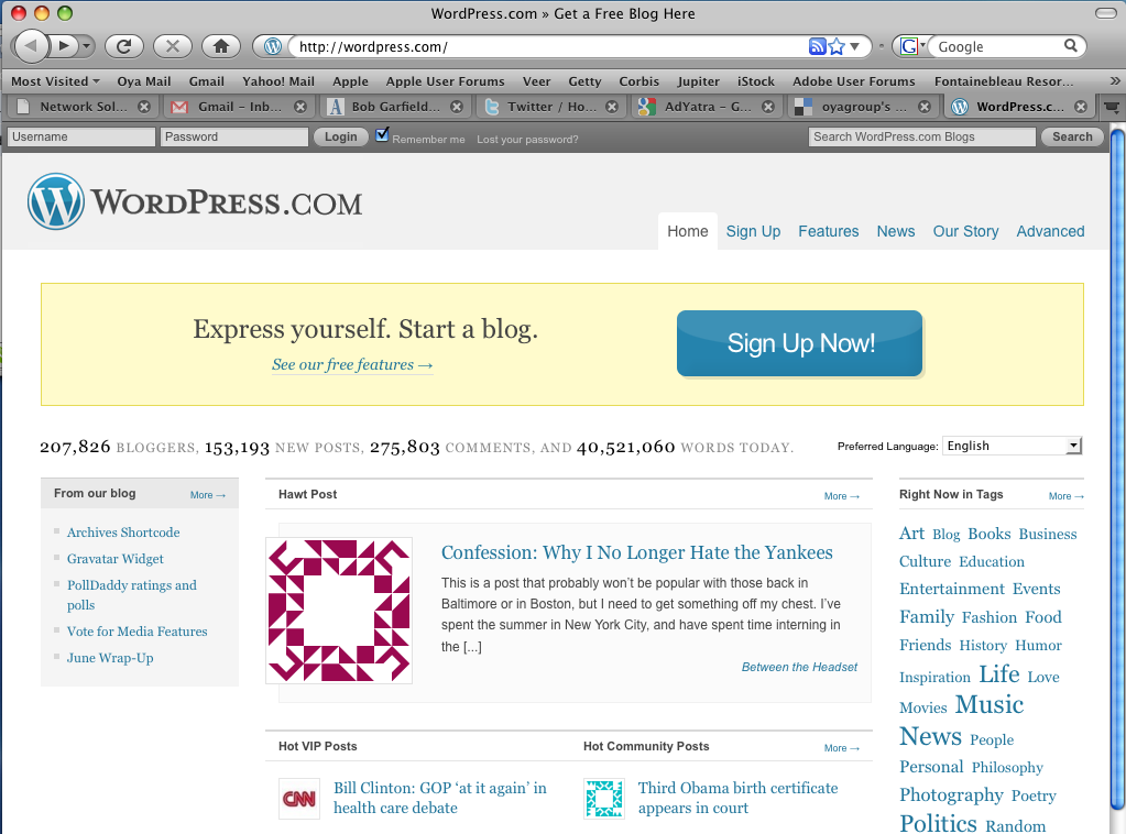
The Incredible Sign Up Button
Is it me or are sign up buttons getting bigger and sign in buttons smaller? I spent at least 5 mins looking for the sign in button/field on WordPress just now and almost gave up, thinking I just needed to get my morning caffeine boost first. Stubborn and annoyed, I continued to scan the page using my cursor like an Exacto blade to carefully dissect the page. I design user interfaces, so why was it so hard for me to figure out where another UI designer had placed the sign in button? I visit WordPress frequently, I should know where to find the front door knob to my own blog domain.
This isn’t the first time I’ve come across a dominant sign up field. Take any of the popular social network sites — Facebook, Twitter, Linked in — and one of the first places your eyes are drawn to is the large sign up button or glowing fields inviting your cursor like a moth to a light bulb. Sure, new users are important and you don’t want to make it difficult for them to commit to your service, but forcing the larger portion of your landing page’s traffic to search for a seemingly invisible button is not a good way to welcome back dedicated users.
Eventually, I found my sign in link carefully crafted into my browser’s UI.


