Alka Seltzer for a Brand

It can be so frustrating. You start a company with some great technology and big ideas. You drive enough demand to show that you really have something that the market wants. You get some funding, and the growth accelerates meteorically. You’re doing great.

Then, one day, your head of marketing walks into you office and says, “Our brand sucks. It’s too hard to use and makes us look too much like the start-up we were X years ago.”

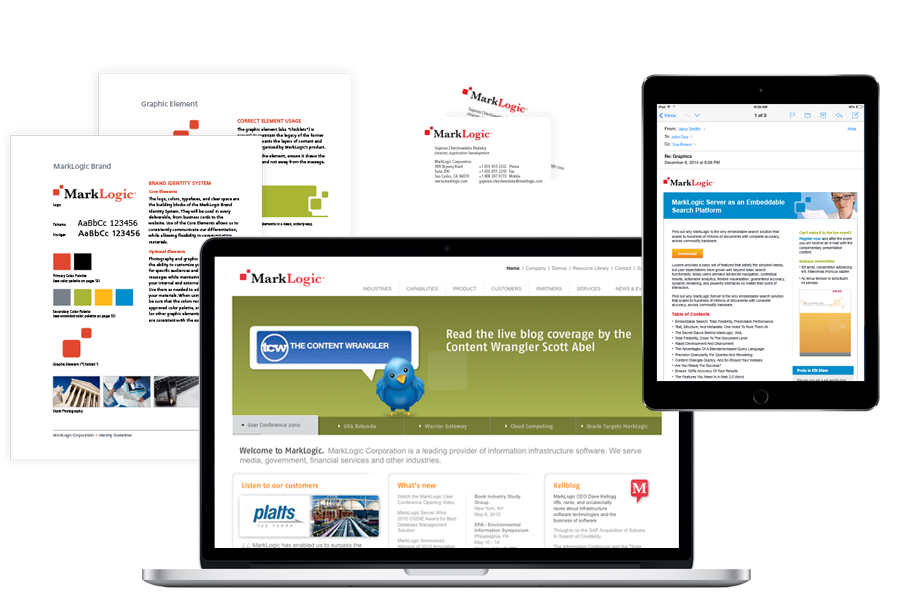
That’s the problem MarkLogic had when they came to us. Their business was doing great, their problem was just with the utility and ease-of-use of the logo, and the small company image it presented. But they didn’t want massive changes; they just wanted to improve things so it wasn’t so difficult to create shirts, hats, and all the other types of tchotchkes a mid-sized company needs to produce. Every time they had a trade show or needed a new folder, the marketing department encountered the same problems, making everything take twice as long as it needed to.

Because of the nature of their software, it just wasn’t possible to talk to their clients or lost business. So we restricted our investigative phase to inside the company, and interviewed the key stakeholders to find out who they thought MarkLogic was, and what were their likes and dislikes with the logo/brand?

What we found were the following answers:

  • The original logo was two lines of copy. The problem was that the size of the fonts was so disparate that in order to make the subhead readable the top line had to be giant, and vice versa.
  • The color used in some of the elements looked unfortunately like dried blood when written large, like on a tradeshow booth or banner. The color palette was dated.
  • The overall look and feel of the design felt like a small company, and MarkLogic was certainly no longer that.
  • The logo used small rounded squares as graphic elements (they affectionatly called them “the chicklets”), and they wanted to keep those as a graphic element.

And so…The Oya Group design team went all-in to redesign this brand for one of our favorite CMOs (Tracy Eiler) who has brought us into several of her companies. “If you guys can’t do it, no one can,” she said during our interview. Nothing like high expectations to get your engine running!

After a few weeks, hundreds of variations, and a lot of internal debate, we presented Tracy and the executive staff with the best five of the bunch (holding a few in reserve, you know, just in case…). The winner was clear right from early in the process—it was the one that generated the collective “Ohhh!” from the group.

Once the main logo refresh was complete we started to work on applying that new brand, colors, and design elements across all marketing materials and tools. From the website, marketing templates, building signage, Marketo email templates, and finally a comprehensive brand styles guide which documented the standards and provided guidance for future works of art.

And, today, that redesign still holdup well on their website and on their building.